This is the go make me something using an airplane. I decided to make the plane crashing into the beautiful Jamaican ocean. It was VERY VERY tedious to make the selections around the cords of the parachute. That took me two periods. Also I infused the parachute onto the ejected guy. I know its bad when your plane is crashing but I love Navy which is what lead to the me picking that parachute design. I used the tablet to hand draw the fire in photo shop.
Friday, May 23, 2014
Wednesday, April 16, 2014
This project was called Giant Ego. It was a rather complex project that dealed with a lot of uncharted waters for me. I don't think I have ever used curves before this project, we worked on fringing, drilling the accuracy of our pen tool, and something I have not really utilized before this project the clipping masks. I found it hard to follow along with the video but I managed to conjure up a rather descent out come to me. I made it a little darker than recommended because it is a poorly lit room and should not be bright. I worked a lot with levels and saturations which was kind of difficult to get it to a number that seemed fitting without distorting the color to much. I also had to use the healing tool and the clone stamp tool to up her skin and the lighting fixtures. Over all it was a long week of struggling.
Wednesday, April 2, 2014
called stone portrait. We took a combination of igneous,metamorphic, and sedimentary rock to create a intricate stone design and texture. To make such a nice portrait you have to have the end goal in mind. I new what I wanted it to look like before I even started. I named this bust Hue because thats all he consists of. If you can believe it i actually learned a new tool today, the lighting effect filter.
D. J. F.
Thursday, March 13, 2014
Wednesday, March 12, 2014
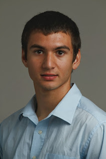
My project for visual design 2 was to retouch my class seating chart photo. I went ahead and used the spot healing tool to clean up blemishes. I then learned how to use smart objects and the high pass filter. I also learned that if you do a blank grey layer that you can mask with out covering over the actual face. I also burned my shirt and hair to make the focus more on my face. I also learned how to make eyes " better looking" through selective color and hue saturation adjustments
This is my El Guapo hot sauce label. I created this label in adobe photoshop but i did use illustrator to create the jalapeƱo. I also had used noise to created a more textured effect on the paper. Then i add reflection across the label using a mask to match the reflection on the jar. This project was hard to create a label because we had to create our own images instead of using them from the internet. which to me was like trying to hurdle the great wall of china… its impossible. So lacking artist ability this was the highest quality i could produce.
Tuesday, March 11, 2014
The top photo is the original template. I was challenged by Mr.C to make this because I said " even i could draw something that bad." I pen tooled the entire out side of the body and then free handed the rest of it using the line segment tool and add anchor point pen tool. I also used the live paint bucket and eye dropper tool to try to match the colors.i had trouble making the socks and the teeth,some anchor points would just not adjust the way i wanted them to.
Thursday, February 27, 2014
This is my ad design after talking with my client and making some additional revisions. I changed the gradient to a tad bit lighter green to make the text a little easier to read. I also made the text a tad bit smaller along the bottom. And of course I removed the hand with the peppers from the corner to go to a more simplistic design with a more engaging focus on the hot sauce bottle.
Friday, February 21, 2014
Thursday, February 6, 2014
Today i was assigned a pen tool exercise in my visual design class. It was pretty easy but a good refresher on how to use the pen tool in Adobe Illustrator. I had a little bit of struggle with like click un-click then click again on the same point which I thought was strange. over all good work flow.
Thursday, January 30, 2014
Friday, January 17, 2014
This was my attempt at making a scholarship poster for the college of my choice. I choose the Naval Academy because it is where I aspired to go. I had a hard time with this project because I had no template to go off of. Also trying to figure out the placement of the pictures was a difficult task. I can be honest and say I did not learn any new features to make this photoshop project. But trying to figure out how to select the intricate gold "emblem" was a task.
Thursday, January 16, 2014
This is my attempt at a vintage poster. In the adobe photo shop cs6 project I learned how to download paint brush fonts, I learned how to select the text and invert it on a mask to provide a knock out effect to the poster. I also learned some elements of adobe illustrator. I had quite a jolly time trying to conjure up my vague knowledge of illustrator to make the banner in the middle.
Wednesday, November 13, 2013
My project completed on 11-13-13 is the magic lamp. In this project I worked with downloading new brush files. I used a hue saturation adjustment layer, I learned how to rotate the brush, gained experience using my table to create sparkles around the lamp. and I also learned how to create at an animation and save my file for web using a gif. I actually Did not have a whole lot of struggles with this project.
Friday, November 1, 2013
Our resent most project was invisible man. It was easy in some ways and hard in others. becoming more experienced with photo shop masking to blend objects has become a lot easier. which is what this project consisted of. I learned to take more object than what I need. I had to recreate the pants sleeve cuffs and collar of tee shirt. The collar was definitely the hardest part. Things I learned were the patch to which is how I removed the head. I also learned you can use the eraser hold shift and click straight across and it will make you a perfectly straight line.
Friday, October 18, 2013
In visual design 2 class this week we learn photo retouching so we could have a new skill and of course a good looking picture to on to our seating chart. I learned how to use the high pass filter, 50% gray layers to make corrections that can also go back and be changed. We also learned smart objects and selective color. I learned how make my eyes " better looking" with quick mask mode.
Tuesday, October 8, 2013
The book I choose to do was Jack Reacher by Lee Childs. It is a great entertainment and has a lot of mystery. This is my dvd cover if the book was turned into a movie. I used actions and the template to get the lay out I was going for. I Thought it was pretty cool the way it all comes together in the end. Doing the text was challenging I couldn't figure out the nexius font program. But over all I Accomplished this product.
Friday, September 27, 2013
Thursday, September 12, 2013
Wednesday, August 28, 2013
out of bounds
This is my out of bounds picture. I thought it was a pretty hard first assignment, considering it exited me out with out saving my work. But selecting the snow boarder went better than I was expecting. Thankfully I did finish today and was able to turn it in on time (which is hard to do).
This one was hard because I was dealing with low res picture quality. But I actually had to select a surfer from a different picture and put him in this one. so that is not the original surfer catching that wave.
Subscribe to:
Posts (Atom)